Myskillcamp · 2021–2022
Building
a course
Myskillcamp is a learning platform for companies. I redesigned its navigation and core journeys, designed the Course Creator that educators use to build and publish courses, and set up the first version of its design system in Figma.
Freelance senior product designer · September 2021–June 2022
Two products in one
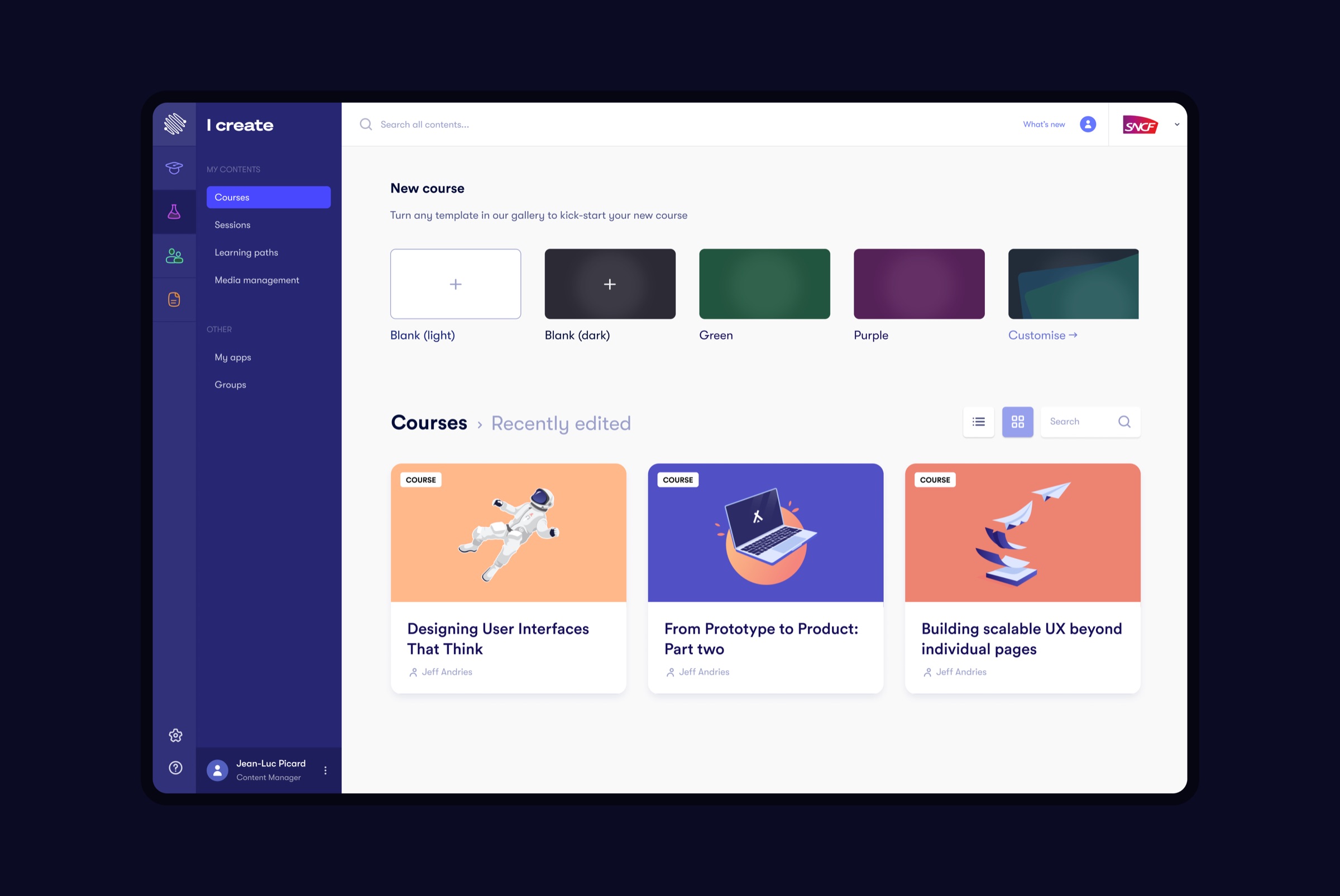
The platform serves learners and the people who make the learning, and they need very different tools. I reworked the navigation around those two sides: I learn for following courses and I create for making them, each with its own navigation, so a content manager lands among courses, sessions, learning paths and media, and nothing else.
Start from a template, not a blank page
A new course starts in a gallery: you pick a template, light, dark or a company style, and you have a course with a cover and structure in one click. Recently edited courses sit right below, because most work is continuing something, not starting it.
A course is chapters, chapters hold content
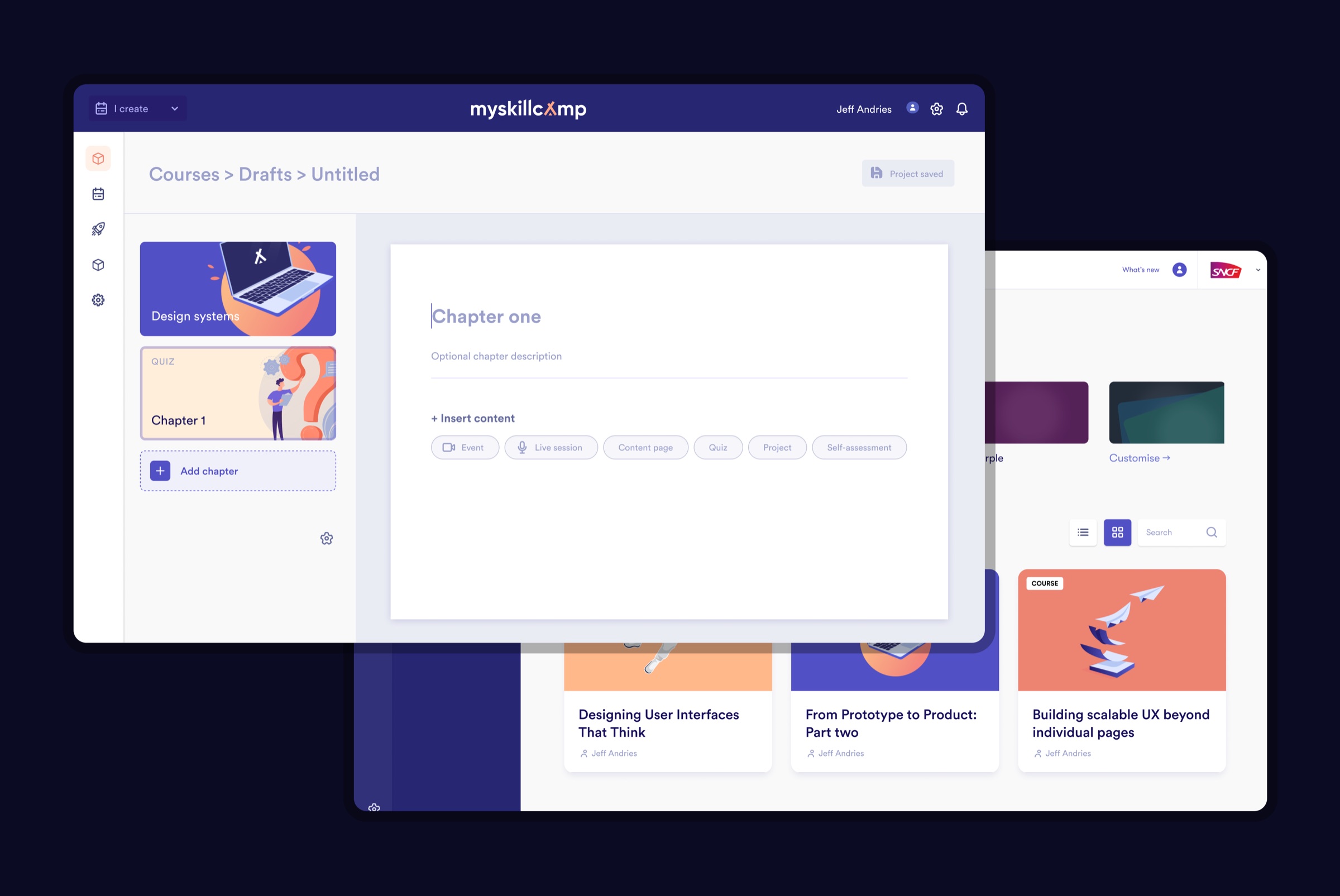
In the Course Creator the structure is always in view on the left, and the chapter you are editing fills the page. Each chapter takes the same set of building blocks: an event, a live session, a content page, a quiz, a project or a self-assessment. The breadcrumb names the course after its title as you type it, and the save state is always visible, so educators know what they are editing and that their work is kept.
From two screens to one page
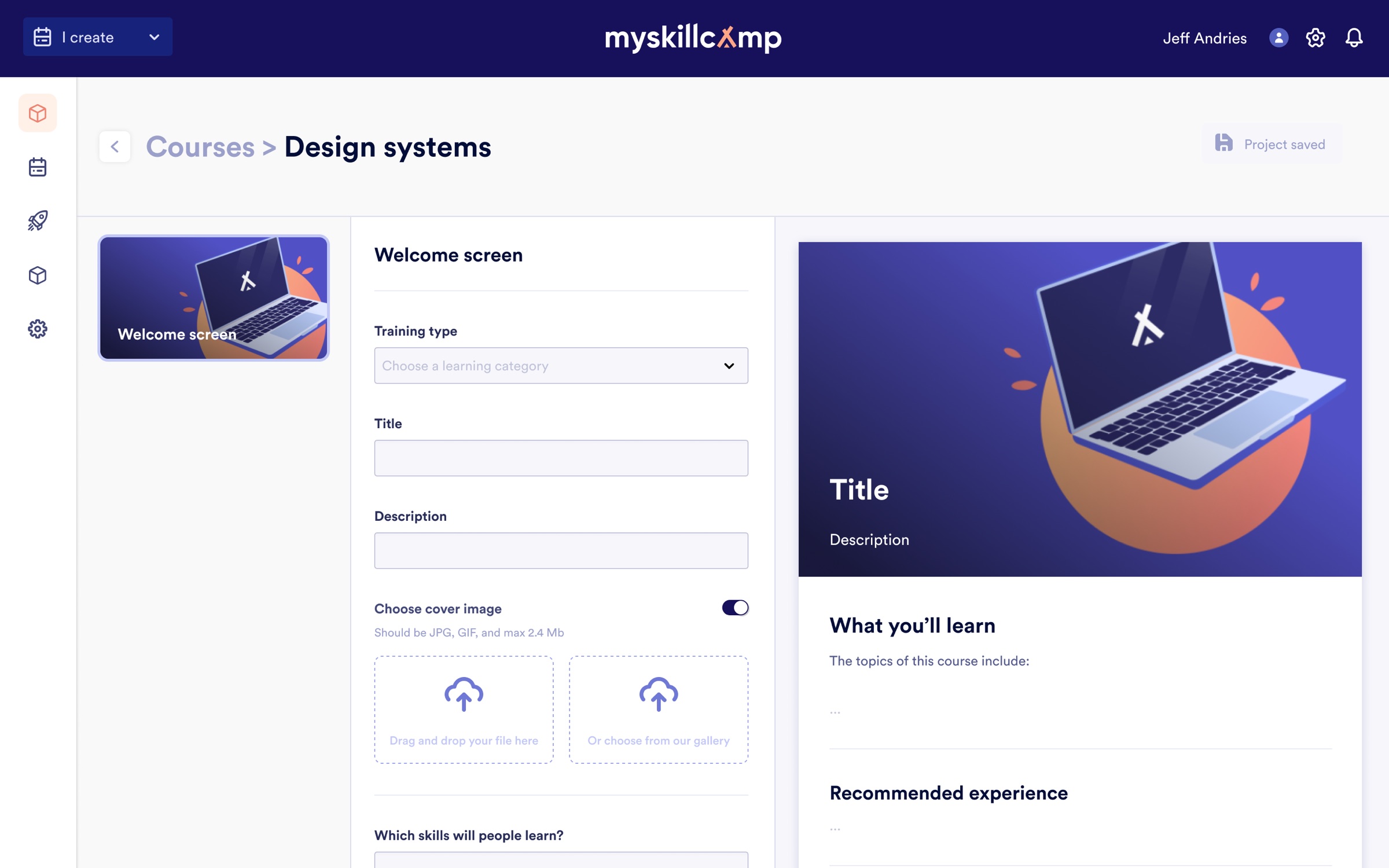
The hardest part was the course presentation: the page a learner sees before starting. I deliberately diverged first. Concept 0.1 put a form next to a live preview. Concept 0.2 added a switch between edit and preview mode, with room for collaboration. I also explored wizards and theming. Each step showed the same problem: educators fill in fields and then have to imagine the result.
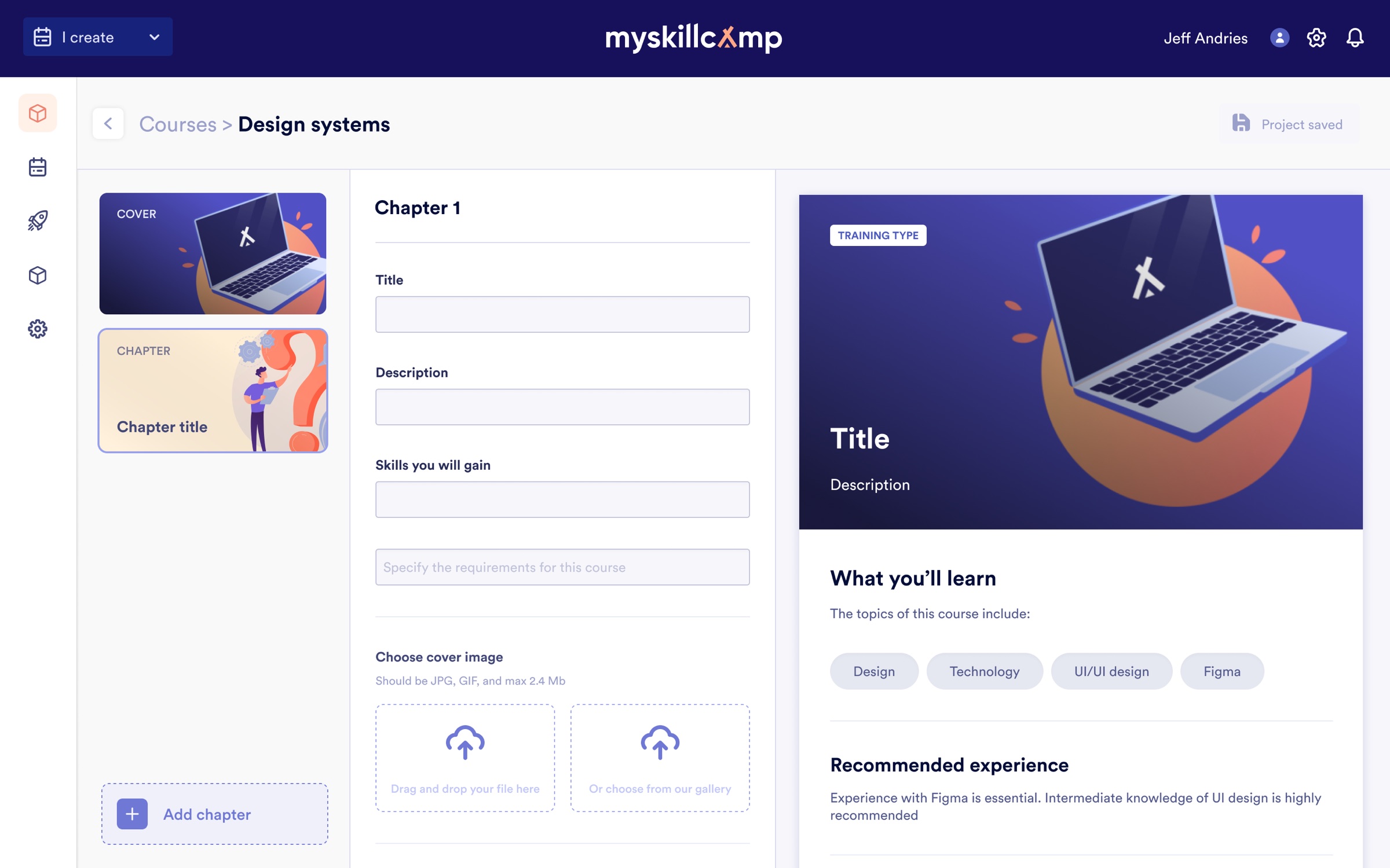
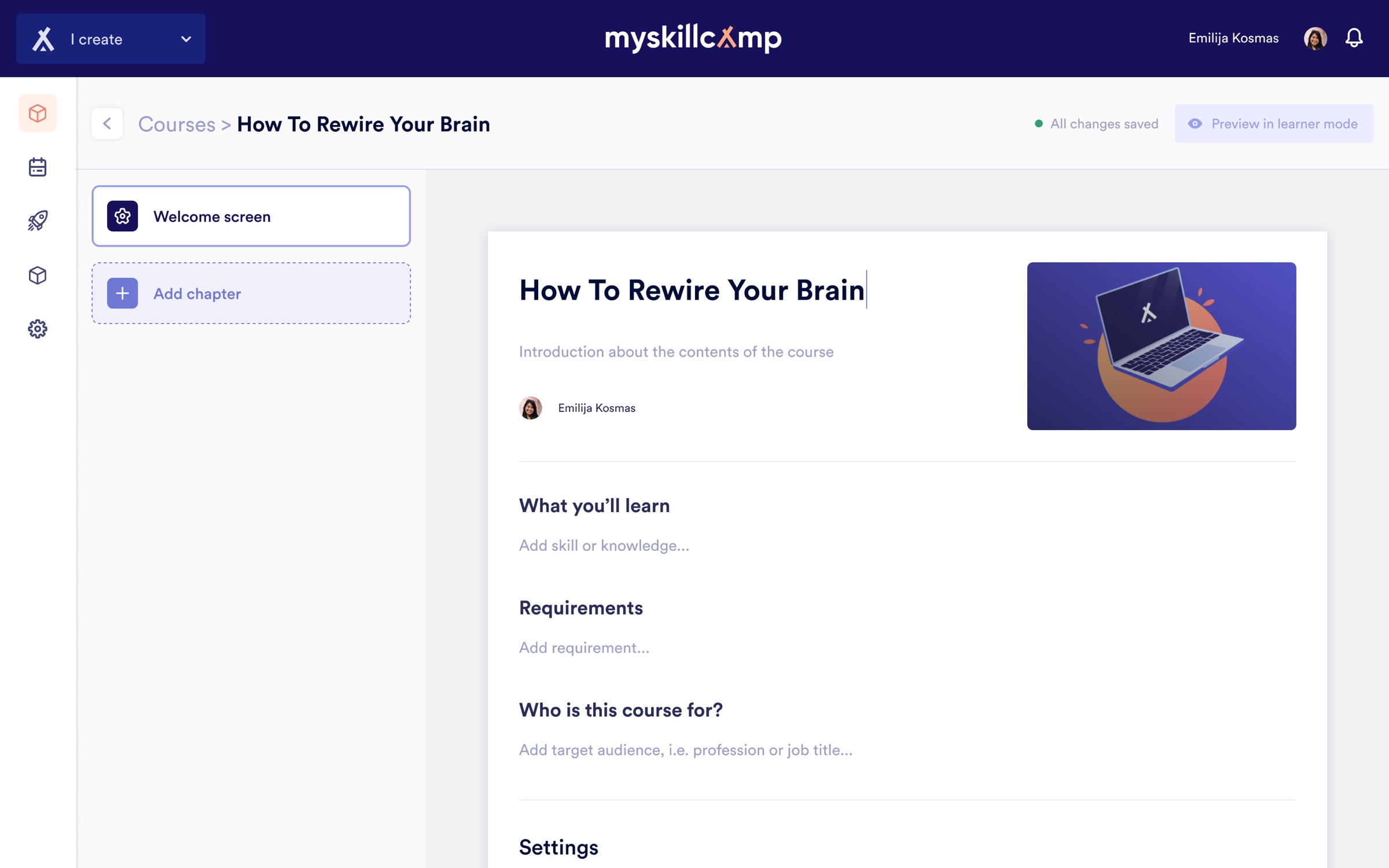
Figma · Course presentation concepts 0.1 to 0.5
Converge on a realistic first step
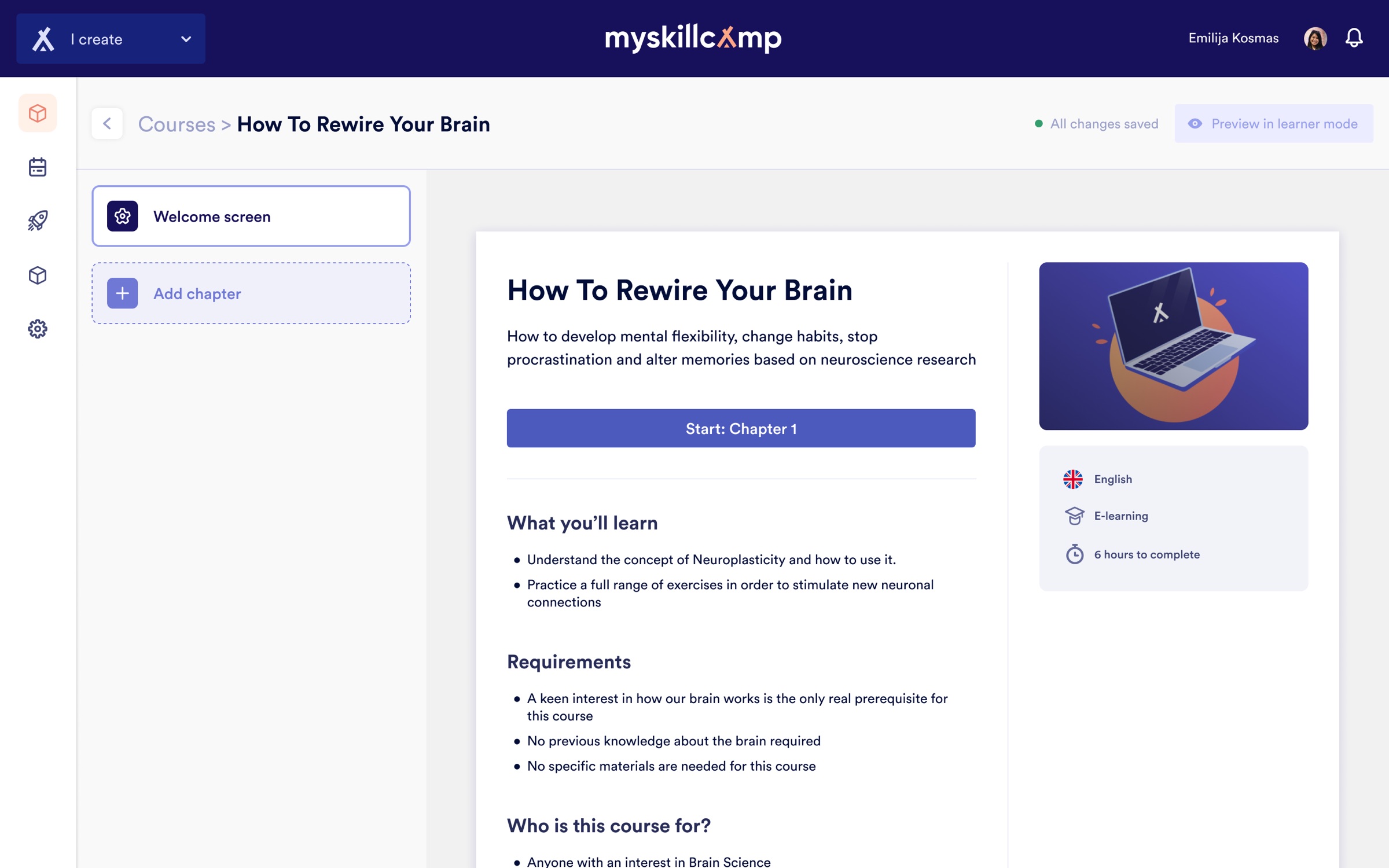
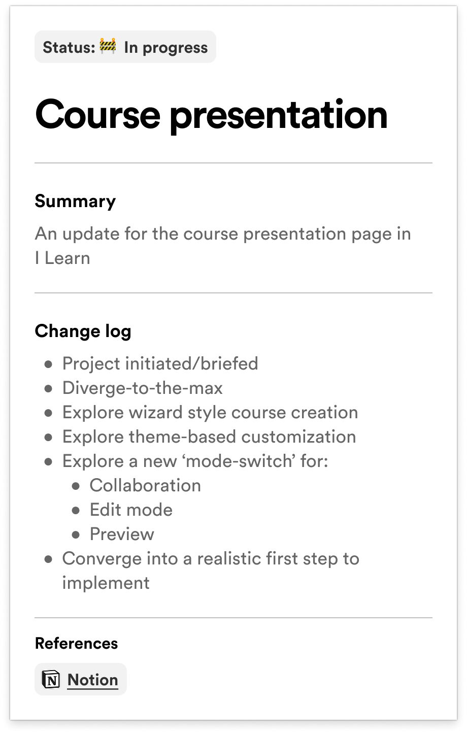
Concept 0.5 removed the form. You type the title, what learners will gain, requirements and audience straight into the page the learner will see, so editing and the result are the same thing. I kept it deliberately simple and proposed lists instead of free text, because people scan lists. Rarely used fields like references moved to an Advanced section at the bottom. A breadcrumb and a visible saved state tell you where you are and that your work is kept. Open questions, like dropping rich text to make it foolproof, went on the board with the team, not into the design by default. Concept 0.6 then set the inline page against a slimmer form, so the team could pick a realistic first step to build.
Foundations first
The platform had grown screen by screen. I set up the first version of a design system in Figma, split into foundations, components, patterns and templates, with attention to digital accessibility (WCAG) in colour, contrast and focus states. I also prototyped a marketplace where educators could offer their courses; that stayed a concept.